plate no. 8132
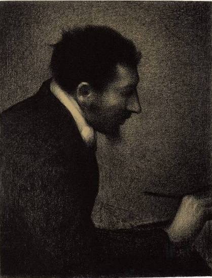
Portrait of Edmond-François Aman-Jean
Georges Seurat, 1883
recreation guide
Georges Seurat’s 'Portrait of Edmond-François Aman-Jean' (1883) is a seminal work executed in crayon on paper, marking an early exploration of his scientific approach to color and form. Unlike his later oil paintings, this work utilizes dry media, specifically crayons, which are described as colors ground with pure water and clay, remaining in a state of powder that adheres to the support by mechanical means rather than chemical binding (Source 1). The artwork is distinctive for its application of Seurat’s theory of Chromoluminarism, where he sought to create harmony through the scientific juxtaposition of complementary colors and tonal contrasts, treating color relationships with the same rigor as musical counterpoint (Source 6).
estimated time
20-30 hours over 5-7 sessions
materials
4 items
steps
4 in sequence
materials
| item | purpose | modern equivalent |
|---|---|---|
| Soft pastels or crayons | Primary medium for applying color in a powdered state | High-quality soft pastels (e.g., Sennelier or Holbein) |
| Rough-surface paper or cardboard | Support with a 'rough natural surface' to mechanically hold the powdered pigment | Heavyweight pastel paper or textured watercolor paper |
| Fixative (optional/cautious use) | To prevent smudging, though sources note the difficulty of fixing crayons uniformly without altering transparency | Workable fixative spray |
| Blending stumps or fingers | To manipulate the powdered pigment and create gradations | Paper blending stumps |
preparation
surface prep
The support must have a rough natural surface or be prepared with a layer of pumice stone to ensure the powdered crayon adheres by mechanical means (Source 1). Seurat likely used a textured paper or cardboard that could hold the dry pigment without requiring a wet medium binder.
underdrawing
While specific preparatory sketches for this portrait are not detailed in the provided sources, Seurat’s general practice involved rigorous planning based on geometric relationships and color theory. The underdrawing would likely establish the 'lines directed upward' or horizontal lines to convey the desired emotional tone (gaiety, calm, or sadness) as per his theories (Source 6).
underpainting
Not applicable in the traditional oil sense. In crayon work, the 'underpainting' is effectively the initial application of the powdered color directly onto the rough support. The colors are applied in a state of powder, with little to no medium, maintaining opacity rather than transparency (Source 1).
color palette
Complementary pairs (e.g., Red-Green, Blue-Orange, Yellow-Violet)
Pure pigments in crayon form
Creating harmony and visual tension through juxtaposition, as per Seurat’s theory of complementary colors (Source 6, Source 3)
Tonal variations (Light/Dark)
Variations in pressure and layering of crayon
Creating chiaroscuro effects where the highest tone is enfeebled and the lowest heightened by juxtaposition (Source 4)
composition
Seurat’s composition is guided by his theory that harmony is the analogy of contrary and similar elements of tone, color, and line (Source 6). The arrangement likely balances warm and cold colors and uses line direction to evoke a specific mood. The portrait genre requires capturing a likeness, but Seurat’s approach emphasizes the scientific application of color laws over mere imitation (Source 5, Source 6).
step by step
underdrawing→first pass→refining→finishing
underdrawing
step 01
Sketch the basic forms and lines on the rough paper. Consider the emotional tone: use upward lines for gaiety, horizontal for calm, or downward for sadness (Source 6).
Tip — Ensure the lines contribute to the overall harmony of the composition.
Line theory
first pass
step 02
Apply crayon colors in a powdered state. Use pure colors without mixing on the palette, relying on optical mixing and juxtaposition (Source 1).
Tip — Remember that crayons contain little medium and remain in a state of powder, adhering mechanically to the rough surface (Source 1).
Crayon application
refining
step 03
Juxtapose complementary colors (e.g., red next to green) to create strong contrast and visual tension (Source 3). Place different tones of the same color next to each other to produce chiaroscuro effects, where the lighter tone appears enfeebled and the darker heightened (Source 4).
Tip — Be aware that the eye may perceive colors inaccurately due to mixed contrast; the color seen may be influenced by the complementary of the previously viewed color (Source 7).
Simultaneous contrast
finishing
step 04
Adjust the balance of warm and cold colors to achieve the desired mood. Ensure that the frame’s harmony opposes the tones, colors, and lines of the picture (Source 6).
Tip — Avoid over-working the crayon, as the solidity will not be equal in all parts, and fixing crayons uniformly is difficult (Source 1).
Color harmony
critical techniques
Simultaneous Contrast
Juxtaposing complementary colors to enhance their intensity and create harmony. Seurat believed that placing complementary colors next to each other creates a strong contrast that is aesthetically pleasing (Source 3, Source 6).
Chiaroscuro via Tone Juxtaposition
Placing different tones of the same color next to each other to create a gradation of light, where the highest tone is enfeebled and the lowest heightened (Source 4).
Crayon as Powdered Color
Using crayons that contain little medium, remaining in a state of powder, and adhering to a rough support by mechanical means (Source 1).
common pitfalls
- →Attempting to fix the crayon uniformly, which is impossible and may alter the transparency and solidity of the work (Source 1).
- →Ignoring the effects of simultaneous contrast, leading to colors that appear dull or inaccurate due to the eye’s tendency to see the complementary of the previously viewed color (Source 7).
- →Over-mixing colors on the palette instead of juxtaposing them on the support to achieve optical harmony (Source 6).
- →Using a smooth support that cannot hold the powdered crayon mechanically (Source 1).
what the sources don't tell us
Where the corpus is silent, we say so rather than guess. These are the gaps a complete recreation guide would normally cover that our source passages don't.
- ·Specific details of the sitter’s appearance (clothing, facial features) are not described in the sources, so the guide focuses on technique rather than visual replication.
- ·The exact sequence of color application for this specific portrait is not detailed; the guide infers from Seurat’s general theories.
- ·The specific pigments used by Seurat in this crayon work are not listed, so modern equivalents are suggested.
grounded in
The technical procedure in this guide traces to the following classical art-instruction texts.
The Science of Painting↗
- CHAPTER XII. CRAYONS, DISTEMPERING, EGG-PAINTING, WATER — applied to Understanding the nature of crayons as powdered colors and the need for a rough support (Source 1).
Laws of Contrast of Colour↗
- 6. Put beside each other two flat tints of different tones of the same — applied to Creating chiaroscuro effects through tone juxtaposition (Source 4).
- 315. As to the advantages the painter will find in it when it is — applied to Understanding mixed contrast and the eye’s susceptibility to fatigue (Source 7).
cross-referenced from
Named facts about this artwork and artist were checked against these reference pages.
Wikipedia: Harmony (color)↗
- Harmony (color) — part 1 — applied to General principles of color harmony and complementary colors (Source 2).
Wikipedia: Complementary colors↗
- Complementary colors — part 1 — applied to Understanding simultaneous contrast and complementary pairs (Source 3).
Wikipedia: Portrait painting↗
- Portrait painting — part 1 — applied to Contextualizing the genre and the goal of likeness (Source 5).
Wikipedia bio — Georges Seurat↗
- Georges Seurat — part 5 — applied to Seurat’s theories on Chromoluminarism, color harmony, and emotional tone (Source 6).
Read more about the corpus on the sources page and how the guides are built on the methods page.
tips & new artworks in your inbox
no spam — unsubscribe anytime.
or to save artworks, chat, and track progress
related guides
in this vein


